BEST PRACTICES TO DESIGN IMPACTING EMAILS
12 Apr 2017

Here, are some good practices to optimise your email marketing campaigns:
Polish your layout
The dimensions of your layout must be limited to the available display width of messaging applications. From our technical point of view, we advocate for a 600px width to your emails.
Tips: reprise the corporate ID of your website to create coherence and seamless experience between your messages and your brand’s image.
Create re-usable templates using your logo, standard footer, header, texts and images placeholders so the reader gets used to identify content quickly.
NP6 Content Designer to create and manage your email templates:

Choose your visuals carefully
Privilege .JPG image format for photos to get the best image quality. For solid colours and icons, .GIF is more appropriate.
It is also important to reduce image size. An email must not weight more than 100ko (maximum recommended). Finally, avoid the spam look-alike where your layout is non-existent and images are inappropriate or of poor quality.
Anticipate images block
Some messaging services will prevent from displaying images when accessing the email. This is why you must not build your email with images only. It is best if it contains 50% images 50% text.
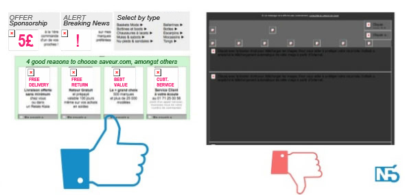
Provide <ALT> details in your images’ tags. if images do not appear, the reader is still provided with some basic content (see our example of ALT details being displayed in pink instead of images).
Finally, always make sure to insert a link to the “mirror page” (view this email in your browser).
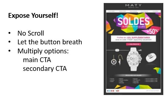
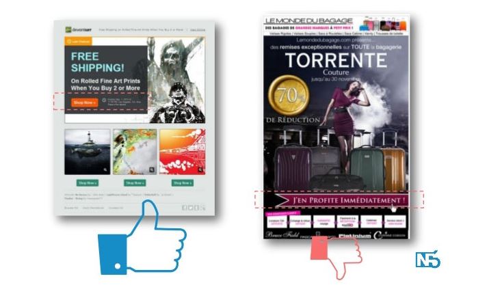
Highlight CTA buttons
The 3 essential elements for a Call to Action are:
- The visual: attract the eye with vivid colours that clearly break with the background.
- The text: must be explicit and inviting to click
- The Position: optimise visibility. The CTA button must be placed in the visible and close to the most active area of your email.
Should you use a button as a Text-Link or as an Image? Both have their advantages and downsides. A text version has very limited graphical possibilities but will be visible even if images are blocked. An image button will always look more attractive.
Note: A good CTA button must be, visible, big, with bold and large police. It must contain high contrast.
Be concise and respect the CTA (make sure the link goes to the right destination). Last, use action verbs.

Please login to comment.
Comments