5 tips for pop-up subscription forms
24 Jul 2012
With email volumes growing year on year for as long as I can remember, it is easy to assume that everyone is finding it easy to grow their lists. In reality it takes focused attention (and setting yourself regular targets) to keep your list healthy.
Most approaches that dramatically increase your list come with an associated decrease in list quality – that is never a good thing as it sets you up for a fall later on when your deliverability takes a hit and your conversions drop.
In praise of the popover subscription form
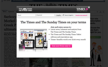
There is one technique that has been championed by retailers and publishers recently that has resulted in dramatic increases in subscriber numbers with no associated drop-off in quality. The popover (or overlay or lightbox!). “Oh no,” I hear you cry. The dreaded popover – that ad format that caused irritation to all and eventually disappeared from most advertisers’ arsenal. That legacy has left a lot of hesitation around implementing a popover to attract subscribers but when implemented well delivers astonishing results without a significant hit to website bounce rates.

Emailguide.com added a lightbox to its website – displaying after 10 seconds – and immediately saw an increase of 482% (80-100 sign-ups on average rising to 478 after one month). Something to think about is what happened next however. When the on page subscription form was removed from the home page, the sign-ups dropped to an average of 195 a month – an increase of 95% when compared to before the implementation of the lightbox but dramatically lower than with both the on page and lightbox sign-up forms in place.
So how should you go about implementing your own popover subscription form? Here are 5 quick tips to getting started.
Tip 1: Be clear and concise
Keep the content in your popover short and easy to read – you are interrupting the user journey so you only have a short time to persuade the user to subscribe so communicating the benefits is critical! Dimming the surrounding webpage can prevent the user from being distracted and focus attention while a large close button will allow users to close it quickly if they want to.
Tip 2: Don’t ask for the earth
The more information you ask for using a popover, the greater the fall off in conversions. Ideally you should be asking for just an email address and then asking for further information later, maybe via a welcome email for example.
Tip 3: Excluding visitors
One way of not annoying a user each time they arrive on your site is to either exclude first visits or those who have repeatedly been shown the prompt without converting. Make sure you also allow some time between prompts if a previous popover has been refused. The specific numbers to choose here will vary from company to company so do test to find your sweet spot. In the past, I have seen retailers start with a prompt on either the first or second visit along with a delay of up to a month if the first attempt was refused.
Tip 4: Make it easy and non-intrusive
Keep the subscription confirmation inside the popover and offer a couple of options on what the user should do next. By not automatically taking the user away from the page they landed on, you do not further interrupt the journey while gaining the option of nudging their path towards pages of higher value.
Finally – don’t forget to deactivate the popover for any links coming from your emails or where it is possible to identify – those users who have signed up previously!
Riaz Kanani, founder of Connected Paths and DMA Email Marketing Council member
@riazkanani
You can find more articles like this from the Email Marketing Council via 


Please login to comment.
Comments