The Psychology Of Colour In Email Marketing
24 Jul 2018

We all realize that colours can have different effects on our mood, and marketers have been using this in branding and advertising since the profession began. Just think about how we describe emotions using colors: feeling blue, seeing red, green with envy etc.
Leveraging how colours can affect emotions is vital for the success of your marketing strategy and efforts. Considering that, on average, a reader spends about 8 seconds on an email once opened, you will definitely want to find a way to attract their attention and interest.
In this post, we will be exploring the psychology of colours in email marketing and what affect these can have on the end-user and even deliverability.
Applying Colour To Email
What captures the reader’s attention once they open an email is not the text, but the visual elements, such as colour, design and images… However, it is colour in particular that can awaken interest, or, conversely, cut it at the root, if the combination of colours does not work well.
To help you with your email marketing strategy and to ensure you use the ideal colour combination to achieve your goals, we have prepared this infographic with examples of real emails and the messages that each colour transmits to the user.

In a Huffington Post article, Leslie Harrington, Executive Director of The Colour Association of The United States suggests that: “we react on multiple levels of association with colors. There are social or culture levels as well as personal relationships with particular colors. You also have an innate reaction to color. For example, when you look at red, it does increase your heart rate. It is a stimulating color. This goes back to caveman days of fire and danger and alarm.”
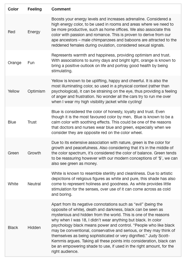
From white to black and in between, here are 7 main colours and the different feelings they evoke:
Keep your product in mind when picking colours
When considering the use of certain colours in email campaigns, the first thing we need to consider is its association to our brand. Maintaining the integrity of the brand is our number one goal, and after that we can start to think about the messaging and the moods that the colours will portray to the audience.
In a research report entitled ‘Impact of Colour in Marketing’, it was uncovered that 90% of decisions made about certain products can be based on their colour alone.
 via KISSmetrics
Gender plays a role when picking colours
Another angle on choosing the right colour for your email campaigns is gender. Psychology of colours can be gender specific and certain colours are favoured more than others by males and females, as KISSmetricsuncovered.
 via KISSmetrics
After considering your target audience, you’ll want to think about conversion. What colours will invite your prospects to take action? We recommend A/B testing (or A/X testing!) as well as Segmentation as different approaches work differently for each campaign and segment.
Here is an experiment done by Hubspot:

Taking into consideration what we have learnt so far about these two colours, as well as putting them in a modern context such as driving, where green means “Go”, red means “Stop”; which of these two buttons do you think had the higher conversion
The red button outperformed green by 21%! Probably not what you had in mind, right? Knowing which colours to use for call-to-actions is an ancient old and biblical discussion that will never end (okay, not really).
The lesson we must learn here is that even if we do our due diligence and research, we should always be testing our campaigns. Every customer is different and their response to each colour can vary depending on a variety of reasons such as mood, location, device used, choice of colour combination and so much more.
Impact of the use of colour on email deliverability
As you may already know, there are a host of key phrases which Internet Service Providers (ISPs) don’t like, which means if these words are used then the email is very likely to go straight to the spam folder. These are called SPAM triggering phrases.
Just like these phrases which may send your email into SPAM, you’ll need to consider your image to text ratio – as a rule of thumb use 25% image and 75% text.
Unfortunately, ISPs don’t reveal exactly what triggers spam filters, however through the same collaborative effort of finding out what words trigger them and what text to image ratio we should be using, we have come to understand that extensive use of red in texts is one of the main tip offs.
Red is known as a ‘loud colour’, so extensive use of it within text or background usually means that we’re really trying to get the users attention. The same principle is used towards CAPITALS, large texts and symbols such as exclamation or the dollar sign.
Most SPAM filters work on a scoring system. Each of the mentioned attributes above carries a maximum score. The higher your total score, the more likely your emails will end up in SPAM.
Final thoughts
So what have we learnt so far? Psychology of colours in email marketing can be tackled from different angles. Next time you’re designing your email campaigns, keep these thoughts in mind:
- Does my colour combination of text, images and background complement my brand?
- Have I overused ‘loud’ colours?
- Have I considered what call to action colours are used to increase conversion?
- What mood am I trying to create with this message and choice of colours?
- “I must A/B test. I must A/B test. I must A/B test. I must A/B test.”
***
This post was originally published on the Mailjet blog - https://www.mailjet.com/blog/news/psychology-of-colors-in-email-marketing/

Please login to comment.
Comments