Designing your Marketing Dashboard to be an Insights Interface
29 Sep 2020

Today businesses need to be smarter with their use of Data. Nowhere is that more true than for marketers. The rise of Customer Data Platforms and MarTech as a whole means that the marketer can, no should take a more thoughtful approach to what their metrics and data tells them. Assuming that more data automatically translates to more business? That is just not true.
The Data-Metrics-Insights-Marketer neuro-link
Data is a resource, which can be used, optimized or wasted, depending on how you set up your marketing processes. Marketing departments can’t make soup out of raw data. So they rely on reporting and dashboards to interrogate the data.

Image source: Data challenges emailmonday (c)
That Data-Metrics-Marketer (neural?) interface is something to talk about. Effective dashboard design plays a key role in determining whether your marketing toolbox will help you succeed in making better marketing decisions, or hold you back from reaching an accurate understanding of your audience.
You might have heard about Elon Musk and the Neuro-link – the effort to interface a brain directly to a computer. Well that is sort of the point here. We want to have direct insights.
Insights that come from monitoring and tracking the impact of campaigns, so smart decisions can be made on testing and optimization. Spot churn and think of ways to increase retention. You’re your audience segments and growth and developments there. And more.
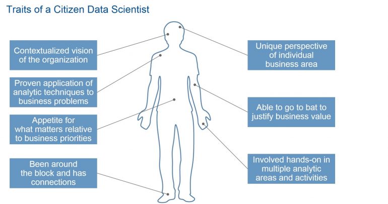
In CDP (Customer Data Platform) land, the main point is that it is marketer managed. But to be able to access data to execute on, isn’t enough, and all need a feedback loop (reporting) as well. The whole process needs to be accessible in a meaningful way. The newer term for that is the Citizen Data Scientist – any marketer or employee that is able to get the powers of a Data Scientist, but without the need of extreme specialization that typically comes with it.

The (un)expected impact of dashboard design
So the interface to the data is more important than you might think. Dashboards shape marketing strategy, highlight urgent matters, and inform marketing tactics. They may even spark creative thinking among your team or boost employee motivation by presenting real-time results.
If that sounds a bit over-hopeful, not really. I was at an ecommerce company the other day and they have their visitors, sales, revenue posted right on a big screen on the wall. That’s already a statement in and by itself. It also shows the goals and KPIs employees should be working towards. During lunch they were talking about a campaign that was completed the week before – and the stats – even the colleagues that weren’t directly involved.
A report from the Dutch DDMA told us that the number one challenge towards Data Driven marketing was an organizational / mindset one: “Creating a data driven culture”. Because culture eats everything for breakfast, right? This is one of the reasons that you may want to (re)consider that a stats dashbaord may need to look more like a project dashboard, yes with tasks, learnings and improvements all included.
Your numbers should be a part of the ongoing conversations and employees, marketing and sales, and key C-level staff to refer to dashboards and reports. Find them compelling, useful, and worth consulting on a regular basis
Problems with bad metrics; data rich and insights poor
On the other hand, misinformed reporting might be worse than no reporting at all. Especially if nothing is done with the numbers or they lack insight or connection with the (business) goals.
Nobody wants to waste time searching for metrics, deliver an erroneous picture of audience interest or campaign results.
In email marketing for example, some ESPs will show you a visual “heatmap” of exactly where people have clicked in an email overlaid on the actual email itself, so it is instantly clear what happened. And a waterfall of the opens, clicks, conversions that hardly take any time to prepare.
While other interfaces only show a link level summary of clicks and lots of un-useful metrics in between. So it takes multiple hours to dig up a decent report (if you’d do it by hand). Guess of those two scenarios of reporting will lack enthusiasm or even will not be made.
If the interface to the data, insights and actions is obstructed or too difficult to navigate, we’ll end up missing out on the (in that case) hidden value of your data. The goal is to design and execute dashboards that form the backbone of business actions.
Tactics for effective dashboard design and interfaces
One of the ways that companies need to look into is selecting the right visualizations to deliver on the answers that the user really is looking for.
Different visualization types are better suited to different purposes. Key visualization methods include:
* Petrol-gauge-style graphs that show how far you’ve progressed towards finishing a project or meeting a goal
* Trend charts to monitor key metrics over time to show, e.g., increased app signups after a display ad campaign, raised brand awareness following a social media campaign, etc.
* Bar graphs showing the correlation between two factors, like the impact of weather on sales or of social media mentions on email newsletter subscriptions
* Maps to display geographic context for metrics like basket or store sales or local marketing. These can even be creatively illustrated interactive maps.
* Leaderboards to show relative performance among marketers, sales agents, or customer service agents
* Click Heatmaps for click and browse behaviour on site items, clicks in emails.
* Displaying visualizations side by side allows you to compare the interaction of different metrics, like churn rates alongside price discounts.
Drilling down and interrogating the data
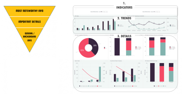
It’s important for users to be able to drill down on the metrics and data in dashboards to see results on a more granular level. These interactive dashboards allow your team to zoom in and out of the data, so that they can begin by looking “big picture”, and then examine the details more closely.
If you only show the high-level view, you’ll be forced to settle for averages, which masks deeper insights and nulls down the metrics. On the other hand, if you present all the fine-grain details when the user first accesses the dashboard, they can be overwhelmed by wealth of data. Keep your graphs and charts clean as too much data turns into clutter.

Even the structure of the reports should make sense. In a reverse pyramid type of way.
Poorly designed reporting brings the real risk of making your marketing department data-rich but insight poor. You want to create a simple yet powerful dashboard that guides the user to actionable insights that shape your marketing next steps.
For example, a dashboard might begin with the overall open, click and conversion rates from a recent campaign series. Other users that are tasked to optimize and are need filters and interactive tabs to investigate which groups of contacts had the highest rates, which items had the performance, etc, and hunt for demographic, geographic, or customer behaviour insights that provide clues to their differing responses.
Dashboard design has (almost) nothing to do with aesthetics
A well-designed dashboard isn’t there to sit and pretty. When you’ve prepared your insights interface carefully, it allows you to spot trends, and explore data for insights you can act on, drill down on KPIs for advanced-level clues to marketing excellence.
Paying attention to dashboard design by using the right visualisations, applying filters and interactive tabs in a way that permits granular data investigation / interrogation, and keeping the interface clean is a path to producing a cockpit that colleagues and managers find helpful, useful, and worthwhile


Please login to comment.
Comments