Data Studio 360: What to Expect from Google's Data Visualisation Juggernaut
11 Jul 2016
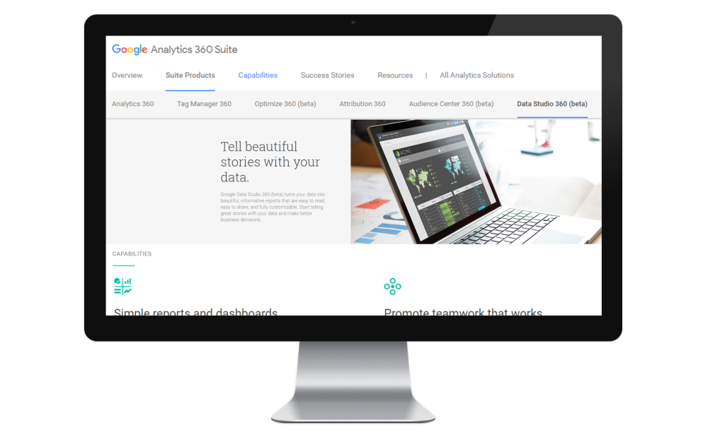
An Initial look at Google's new reporting tool from the Google Analytics 360 Suite, Data Studio.
A new challenger approaches
Google's Analytics 360 Suite is all about the specialization of tools used in the different aspects of our online marketing and analysis process. Google Analytics can't do everything perfectly so Attribution and Reporting will now have their own tailored tools via Attribution 360 and Data Studio 360.

We're all really excited to use the 360 suite with clients, but we all have our favourites, and for me Data Studio is right up there. It's an integrated reporting platform that aims to cure the troubles that may have been encountered with Google Sheets and GA Dashboards by being flexible, intuitive and by giving quick results.
The Interface
At an initial glance Data Studio looks familiar; this is because it's been built with the flexibility of Google Docs in mind when it comes to sharing and collaborating. The main menu demonstrates the two key aspects of Data Studio:
Data Sources

Data Sources are the individual connections that are made to data hubs like Google Analytics, DoubleClick and Google Sheets. Once a connection has been made we are able to pull in that tool's data on which to build reports. So far, Data Studio looks to be building upon connections to the 360 Suite and wider Google stack; from there the plan is to eventually include third party data sources as well.
Reports/Widgets
Reports use the data gathered by the connections to data sources in order to populate tables, graphs and other data visualisation widgets. There are two states that a report can be in: edit and view. View allows users to see the fruit of your labours without the risk of any configuration changes. Edit is where the data visualisation takes place; this is where you'll be spending most of your time when building reports in Data Studio 360. It is here where you will build your dashboard using the widgets and tools available. The key tools available to you can be split into three categories:
- Data Visualisation: There is a strong list of different widgets available in Data Studio, ranging from time series and 2:1 metrics to Geo maps and scatter charts.
- Styling and themes: This lets you draw shapes, add text and import images to bring your dashboard more in line with your company's own internal branding guidelines.
- Controls: When in view mode you are able to highlight data points and interact with tables and other widgets. However, if you are interested in seeing the same data for a different date range or perhaps adding dynamic filters that allow you to compare different campaigns, channels or other dimensions then you'll need controls. Controls let the viewer dynamically change the data being fed into the report without giving them the chance to change the initial configuration.

Strengths of Data Studio
So far what we've seen is not too dissimilar to what other data visualisation tools can offer, so what sets Data Studio apart from the competition?
- Data Sources: We've already seen how data sources can be used to bring data into a report but this feature doesn't stop there. Multiple data sources can populate a report at the same time, meaning we can now see Google Analytics, DoubleClick, AdWords and any other data sets alongside one another within the same report!
- Sharing: Because Data Studio has inherited some of the aspects we know and love about Google Docs, sharing is incredibly simple. Links to the report can be sent with view or edit access and can be done via email or a copied link.
- Collaboration: The ability to have multiple people tweaking the same report concurrently in real time can give rise to an immensely different work flow.
- Efficiency: The speed at which reports can be created is truly incredible; an instinctive click and drag model makes producing graphs, maps and tables exponentially faster than it would be in Google Analytics or Google Sheets.
This is a demo report we put together in 15 minutes showing some headline stats for the Merkle | Periscopix website:

We've only scratched the surface when it comes to Data Studio; we'll be following up with a more in depth look at some of the cooler features of this game changing tool, so stay tuned!
Post-script: As of 1 July 2016, Data Studio is available on both free and paid versions in the US. Outside of the US, Data Studio is in beta, via application-only. Please get in touch or speak to your Google Account Manager if you're interested in finding out more.
To view this blog written by Dan Jennings on the Periscopix website, please click here.

Please login to comment.
Comments