Data Best Practice: The Power of the Privacy Notice - Case Study
22 Apr 2020

This article is written by Leah Munting, chair of the Best Practice hub and member of the Customer Data Council.
To help bring to life the Best Practice Hub’s recent mini-series of DMA Data Guide take outs, we’re going to focus in on some of the organisations doing it right and how.
As we said in our first post, Privacy Notices are an often overlooked but extremely powerful tool in communicating with (prospective) audiences.
Relationship Building
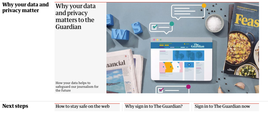
Looking at the 2018’s DMA GDPR Communication Gold winner, The Guardian online demonstrates a clear customer focus within their online privacy section from the outset:

By placing the reader’s data at the core of the subject, it prevents the notice from being yet another introspective policy, which ticks just a legal-requirement box. Instead this puts the individual data subject front and centre, answering real concerns, resulting in a positive view of the brand from the eyes of the consumer.
Make It clear
Nearly 15% of English adults have a literacy level equivalent to an 11-year-old, so it’s vital that you are clear in your privacy policy and don’t fall into jargon traps. Remember it is meant to be useful and understood by your customers.
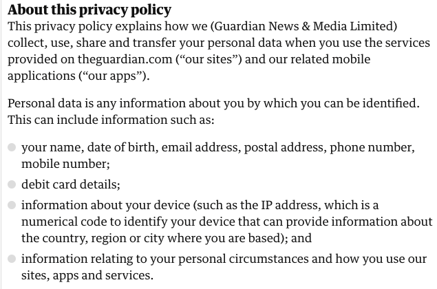
Before launching into the policy proper, The Guardian online has a brief summary-notice, answering common questions upfront, saving any frustration caused by scrolling and searching through the text.
By providing examples and using phrases such as, “This means”, you will provide clarity for your audience. Using emboldened headers and bullet points breaks down dense information, making it easier to understand:

However, if an image is worth a thousand words, then a video is an invaluable and engaging way of telling viewers concisely how you approach their privacy. Within their Privacy hub, The Guardian’s Privacy Video (which can be found here) is a short watch that highlights the important points, which can be easily rewound, rather than getting lost amongst paragraphs of information.

The friendly voiceover, animation and soundtrack all make this a pleasant and relaxing experience, rather than a laborious one.
Ensure compliance
Whilst there are easy-to-digest take-outs upfront, it is still vital that The Guardian fulfil their legal obligation and post a comprehensive privacy notice. This adds another level of detail and information for those needing it, supporting the other informative assets on the hub.
Easily Accessible
There is no point in putting in a lot of work to capturing your approach to privacy in a clear, easy-to-comprehend structure (whilst also complying with the law) if it’s not going to be easily found by your audience. By including links in emails and displaying them on your website, your hard work will be seen.
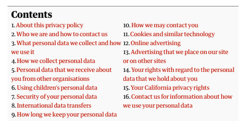
The Guardian online use a handy contents table, which links to different sections for easy navigation:

Adopting technical functions such as linked content tables and in-policy links to additional information increase user ability. Accordion structures are also a brilliant tool when your privacy policy is especially dense; when a user expands one section, they can easily collapse it and navigate to others, saving time, saving from scrolling and resulting in a better experience.
Take a look at The Guardian’s winning work here.
Need a refresher on the do’s and don’ts? See the DMA’s Data Guide, here.
See more from the Data Council, here.
Read more from our Data Best Practice series:
The Power of the Privacy Notice
Acquiring New Data Under GDPR - Case Study


Please login to comment.
Comments