Get your social icons noticed
05 Mar 2012
There’s a lot more to social icons than adding a “share with your network link”. Brands need to find ways to invite consumers to share content, by making links prominent and giving people a reason to share. See how ASDA, Boots, Monsoon, Screwfix and Evans Cycles fare.
Social icons – the next big thing It was the next big thing. You add a “share with your network” link to your email and boom, your content goes viral, you get a load of new subscribers, revenue goes through the roof; you get a pay rise and take the rest of the month off. Since you are reading this, I'm guessing that’s not what happened for you. The Twitter, Facebook and YouTube and other icons now appear in the vast majority of top brand emails.
However, from recent campaign analysis I’ve been doing some of these icons are bringing very little value with fewer clicks than the unsubscribe link in some cases, that's under 0.5%. Are social icons earning their keep? Let’s say you send to 100K people, 0.5% share the email, that’s 500 shares. Then of these, 1% convert to a subscriber or purchase. That’s just five people. If a subscriber is worth £10, the link earns a total of £50. Is this really the best use of email space? Either the social links should be removed or made to earn their keep.
4 reasons why social icons often aren’t doing the job
- Confusion around what the icon is for, is it to share or to like?
- Location in the email
- A weak or no call to action
- No incentive to click
Or it may be that it’s just the wrong time in the customer journey to be asking for a share or a like.
The purpose of most emails is to get a click-through as quickly as possible to a website where the real selling takes place. The email is just to sell the click. So the email is not the point at which a consumer will be convinced enough about an offer to want to share it.
Social icons from 5 brands
I’ve picked five examples of social icon furniture to compare.
1. Evans Cycles provides no reason to click and no indication whether clicking will share content or like/follow them.

2. Monsoon does give indication that one of the Facebook icons is to share content, though again there is no reason given to do this and putting grey icons on a grey background is making them very easy to ignore.

3. ASDA has a good-looking graphic and a call to action, though this invites you to find reasons not to tell your friends – “Why not”. Also it’s not clear where to click (hint, it’s not the Envelope), and whether it’s the Facebook or Twitter icon that’s clickable.

4. Boots provides good clarity about the purpose of each Facebook icon.

5. Screwfix does the best job of why engaging socially is worthwhile, inviting you to “show your project”, “see their products in action” and so on.

Social icons: think location
As for location, in most emails the icons are at the bottom with a few brands putting them at the top. I can’t imagine many consumers seeing a great offer in the email and thinking “I must scroll to the end, find a share icon and click it”. The share needs to be right next to the shareable content. This then competes with what you really want, the click to the website.
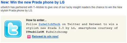
So, check if your social icons are doing the business for you and if not fix them. If they can’t be fixed because it is the wrong time to ask the consumer, then drop them from the general email furniture and run specific email to social cross pollination campaigns and incentivised competitions, such as this from a recent uSwitch email:

Of course, social integration goes much further than adding a few social icons, but that’s another story.
Tim Watson, Founder, Zettasphere
You can find more articles like this from the Email Marketing Council via 
 .
.


Please login to comment.
Comments