Font colour change causes 74% click difference
04 Nov 2013
A split test with identical results doesn’t mean there is nothing to learn. A case in point is the split test covered here. It shows how valuable lessons can still be found by looking deeper even though the split test gave identical overall unique clicks results.
By drilling into individual calls to action we found a 74% difference between the control and treatment.
This split test is the third test run as a follow up to two previous tests. The first test delivered a 61% increase in unique clicks. Tests two and three were designed to tell us more about what drove that difference so the principles can be carried forwards and re-applied.
This test was to understand the value of the Editorial section. In a previous test the Editorial section was in the control and not the treatment. Could adding the Editorial to the treatment increase response or would it just change reader behaviour?
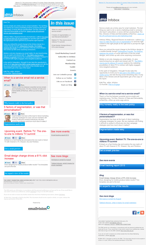
Here are the emails tested, control on the left and treatment on the right.
The summary result was identical click through performance. What was there to learn from this?
I analysed which links were clicked. Each main article is promoted both in the Editorial section and in the main body following the Editorial.
A big difference between the control (left) and treatment (right) became apparent. The table below shows the uplift on the treatment over the control for links in Editorial area vs main body. Uplifts have above 95% statistical significance (check your test results with this ab split test calculator).
| Editorial links | Body links | |
| Uplift | 74% | -70% |
In short whilst the overall number of clicks was the same, where people clicked was changed by the design. The treatment received the majority of the clicks in the Editorial area and had weak performance in body. In fact body clicks reduced by 70% over the control.
Why does the Editorial perform badly in the control?
There are two obvious reasons why the difference occurred:
- People find scan reading of white font on a blue background harder than the higher contrast of black on white. So they tend to skip over the editorial and scan the body and large sub-heads to pick out content of interest.
- Readers are using the ‘In this issue’ bookmark links in the control right column to skip to the body content.
Bookmark links, which just jump the reader to another place in the email rather than to a landing page, are not trackable. So we don’t have data to confirm or eliminate the second possibility.
The test results imply that the treatment can be reduced to just the black on white Editorial and the remaining simple email will give good performance.
Three lessons from this test
- Look at individual link clicks for more insight and not just top line metrics when doing split tests on designs.
- Focus design on simplicity. Get to the point and don’t make your email over complex simply because it looks more designed.
- Avoid use of white font and coloured backgrounds. Black on white is just fine.
Remember the real world isn’t perfect.
Device tracking was included in the test with the intention of drilling into behaviour differences between desktop and mobile users.
When I looked at the device results they were quite remarkable. In fact so surprising I had to question the data. After digging deeper it became clear that a technical gremlin had meant the device tracking information was incomplete and the data could not be used.
The lesson here is be prepared to question everything. Especially if something looks too good or too bad to be true. Working with fundamentally wrong data is at best a waste of time and at worse takes you in the wrong direction, leading to worse results.
What next?
We’ve another test planned in this series that will drill into a different element of the control and treatment. I’ll be sure to share the results so come back next month and find out.


Please login to comment.
Comments