Email design change driving a 61% click increase
06 Sep 2013
You can’t have missed the many reports and stats about the growing use of mobile devices to read email. Brands I work with are seeing anywhere from 15% to 70% of their emails being read on mobile devices. The average is 45% and the most popular email client, rated by number of emails opened, is now the iPhone, source http://emailclientmarketshare.com/.
The DMA have been testing a new mobile first email design. Its optimised for mobile with a skinny design approach of 400 pixels wide, as opposed to using another technique such as responsive design. If you’re not sure about the different mobile design methods then read this short primer that explains skinny, scalable, fluid and responsive email design.
The DMA use the same template across many of the DMA newsletters. The design format change was put to the test by the DMA production team with an A/B split for the DMAs ‘Infobox’ newsletter. A newsletter dedicated to email marketing.
The skinny design treatment delivered a 61% increase in clicks over the control, with statistical significance of 99%.
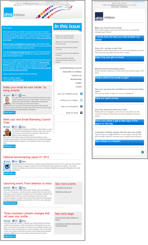
However, the conclusion is not the obvious one. Can you see why? Here are the two designs used in the split test:

We can’t conclude skinny rules just yet. In making a design change of this significance there are many factors at play. Potentially important changes in this design treatment include:
- Mobile friendly width change to skinny 400 pixels
- Single column layout
- Removal of thumb nail images
- Increase in font size
- Large call to action buttons
- Removal of editorial introduction
- Reduced copy
- Changed call to action copy
- Removal of in this issue contents list
So the question arises as to what really drove 61% click increase? Drilling down into clicks on individual links gives more insight.
I would expect some of these factors to change click response evenly across all links, such as font size change.
However, I found one particular link in the treatment was responsible for the majority of the overall click increase in the split test. This implies the copy and call to action changes are driving the click increase and not the change to skinny design.
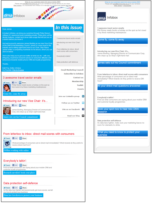
To put the theory to the test that copy changes were driving the difference a further test was run, this time further synchronising the copy between the control and treatment, in particular ensuring the same calls to action. These are the two emails in the split test:

Note how the control, the design on the left above, now has the same calls to action and lead in copy to the CTA button as the treatment.
On this test there was no click rate response difference between the two designs and in fact both performed well. The skinny mobile friendly design no longer looks to be the cause of the improvement.
It would have been easy to initially conclude that the mobile friendly approach is driving the results after the first spit test. However, a failure to truly understand key causes of change means you’ll make future decisions based on your wrong perception of what’s important.
There are always unanswered questions, in this test what about:
- The impact of the introduction editorial copy in the email, does it increase clicks or just re-distribute them?
- Is there a difference in response between desktop readers and mobile readers with the different designs?
The DMA has further tests planned to provide more answers and gain clarity as to how design can improve click response for the DMA . Watch out for an update on this blog and I’ll be sure to share with you as to what we find next.


Please login to comment.
Comments