Creative Effectiveness in Door Drops: July 2022
25 Jul 2022

Written by Neal Dodd, Managing Director of The Letterbox Consultancy and member of the Door Drop Hub of the Print Council.
What better demonstration of your faith in the door drop channel, than to use it to promote your own business?
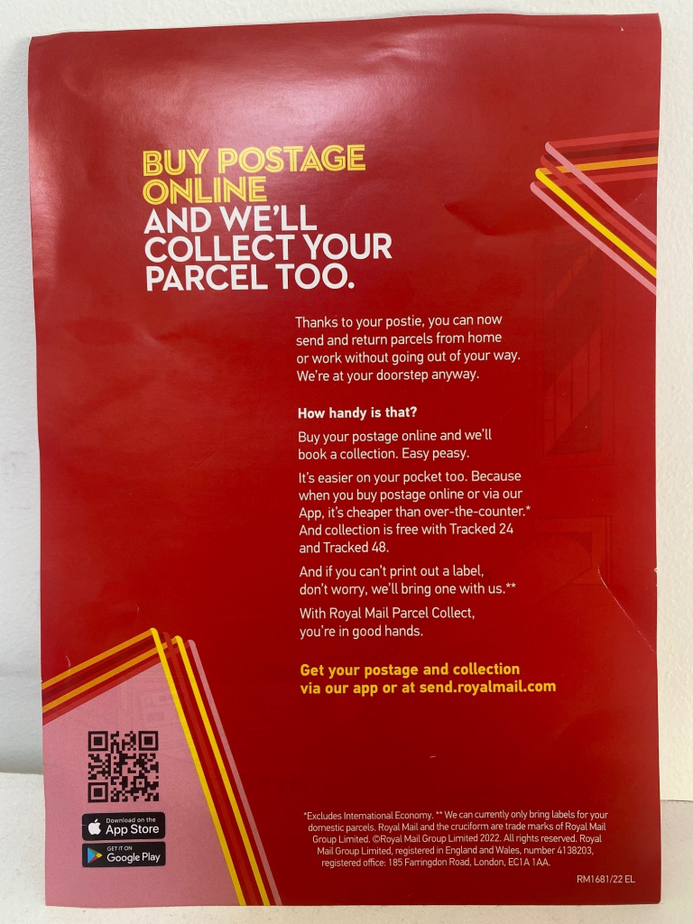
I smiled as I collected this leaflet from my doormat; Royal Mail using Royal Mail Door to Door to deliver leaflets to residential properties, promoting their new Parcel Collect service.
Reviewing this creative, we should consider the immediate effect that a brand as strong as Royal Mail’s has on how the leaflet is greeted by residents.
Much like other any other large, established business; people will know Royal Mail, recognise the logo and colours, and understand their overall proposition, which should ensure people are more likely to look at the detail of the leaflet and it affords the sender more creative licence to explain their proposition.
Conversely, in my view, smaller brands that may not be known by the recipient might need to consider focusing more on the headline offer featured on the leaflet.

Onto the leaflet itself, it’s a slick design that is to the point with a clear headline on the front and some short copy on the back to outline the proposition.
The creative is simple and consistent, which is nice to see as we so often see leaflets crowded with information and varying fonts / colours. The simplicity will help recipients understand the proposition quickly.
The copy is well written; punchy and focused on the benefits of the service, with all the necessary information packed into just five paragraphs.
It’s interesting to see Royal Mail using the QR code as one call to action, something we are seeing more and more on printed media and a great addition to tracking linear response.
What might Royal Mail consider changing?
It’s just my humble opinion of course, but I wonder if Royal Mail could have put greater emphasis on the fact that so many people know their local postie by including imagery of a member of staff and a customer on the front, rather than an animated image.
The personal touch of seeing a real-life handover, with real-life staff, might have added to the engagement of the front page and enhanced the message of trust and reliability that I think people associate with Royal Mail.
Secondly, I noted that collection is free with two of Royal Mail’s tracked products.
Could the word ‘free’ have been used in the headline, perhaps? We know that the word has a powerful impact on recall and engagement, so it would be a positive change – although given the breadth of postage products available, perhaps this wasn’t viable.
Either way, my gut feel is that there might have been an opportunity to change the headline to be a little bit more benefit led.
Overall though, it’s a nice leaflet – smart, easy to digest and an endorsement of the channel from media owners themselves.
Great to see and it’ll be interesting to see if Royal Mail repeat it!
Click here to see the latest Creative Effectiveness in Door Drops.
See more from the Print Council here.


Please login to comment.
Comments