Stop everything â we need to re-design for mobile devices
19 Apr 2013
There has been a lot of talk over the past few weeks among various groups about whether or not mobiles have become so important that we should all be designing new templates for mobiles either optimised or using responsive design. A recent study by Blue Hornet says that 80% of people will delete an email on a mobile device if it doesn’t look good so this suggests that we should.
Now, a survey is only as good as the questions it contains and how these are phrased so let us look at the question. “If you get a mobile email that doesn’t look good then what do you do”. So what constitutes “does not look good”
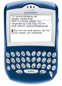
Lets go back a few years to the days when Blackberrys where the only smartphones we had to worry about. In these days the html renderer on a Blackberry was pretty terrible and only the simplest of html would be readable and older versions would only give you the text version of the message. If was pretty safe to say that any html you sent would not look good.
Nowadays the html renderers on smart phones are excellent and they will pretty much render anything that a desktop email client will. Just because people are opening your email on a mobile device and you haven’t fully optimised your campaign for mobile it doesn’t mean these people aren’t engaging with your campaign.
So, everyone can relax a little. Without doing anything, you have a mobile strategy because people can read your emails on a smart phone and engage. It maybe harder to navigate around the email on a mobile device and the calls to action a little difficult to click but if your email looks good on a desktop then the odds are it will look ok on a mobile device. If you want to improve the user experience on a mobile device then it is not about getting your campaign to render on a mobile device but about optimising it for mobile devices.
The question is will this improve your campaign results? Every campaign is different and just because Litmus say that 43% of emails are read on a mobile device it doesn’t necessarily translate to your target audience. Tim Watson from Zettasphere analysed the data and found there are still campaigns at both ends, some with almost no mobile activity and some with almost only mobile activity. If you have historical campaign data to your subscriber base then look at your open stats and see what your mobile open rate is across a variety of campaigns.
However, don’t be misled by your mobile open rate. Just because someone opens your email on a mobile device it doesn’t mean they don’t then open it on their desktop as well. If I receive an interesting email on my mobile device but find it difficult to read I just wait until I’m in the office and read it on my desktop.
One thing that does generally improve campaign performance is re-designing an old template whether it is related to mobile or not. If you put the time and effort in to look at your existing template and re-design it with the mobile user experience in mind then I would expect your results to improve. No matter whether this is related to mobile opens or not. Its a win win. The new template should get more opens on the desktop and mobile devices.
Everyone should be thinking about mobile devices and how this affects their campaigns but you don’t necessarily have to drop everything and rethink what you are doing. Look at your recipients and stats. If it has been a long time since you changed your template then it may be time to think about creating a new simplified template with mobile devices in mind.


