EMAIL RESPONSIVE DESIGN: BEST PRACTICES FOR MOBILE DISPLAY
13 Apr 2017

Email user behaviours have drastically changed these last few years with the rise of mobile devices. The Email Marketing Attitude Survey 2016, carried out by NP6 for the SNCD (the French equivalent of the DMA), revealed that half of web users check their emails on a mobile device (smartphone, tablet or connected watch).
While once it took several days for a campaign to be effectively exposed to all targets, it now takes mere hours for almost all recipients to react to an email campaign (provided there is good deliverability). With there being almost as many mobile display sizes as there are mobile devices on the market, it’s become essential to optimise campaign rendering, integrating Responsive Design into the earliest stages of your content creation process.
Forward thinking
To optimise an email message across all displays, you need to plan for recipients reading the message horizontally (computer screen) and vertically (smartphone screen). There are technical ways to do this, such as using code (CSS, media queries, etc.) that can detect the device being used to read the content and adjust the display accordingly.
The golden rule is think simple and efficient. From the very beginning, all the elements must be able to be displayed equally well horizontally and vertically – this means that two side-by-side elements on a horizontal display (on a computer screen) will appear on top of each other on a vertical display (smartphone). This applies both to your images and to your text. Find out more about layout in this article: The best graphic practices for high-impact email designs.
Technical skills
In today’s world, a huge range of devices are being used to read emails: computers, tablets, smartphones, connected TVs… It’s important to understand that each device has its own way of interpreting code. In fact, because each device reads the code differently, it won’t necessarily be executed in the same way.
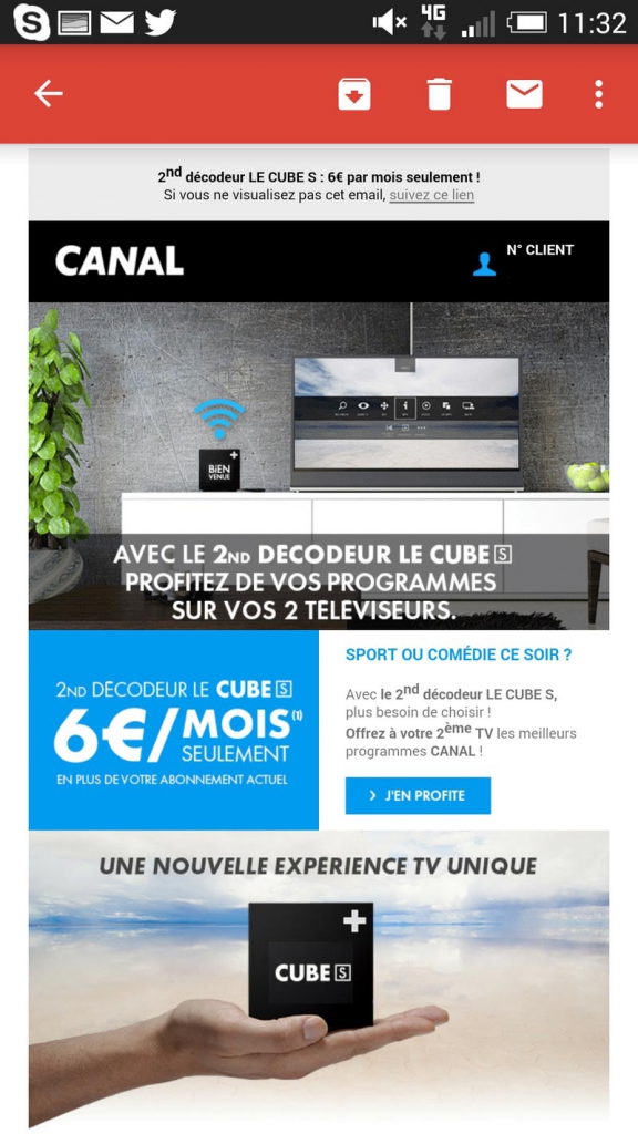
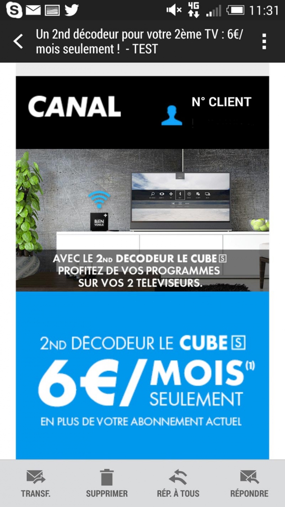
To get the right rendering across devices, it’s important to take these technical constraints into account, and simplify your content to avoid errors with interpretation. For instance, when reading an email on a Gmail account using a laptop, it will appear differently when reading the same message on a smartphone’s Gmail Android application. Another example would be to look at an email from your Gmail application and from the default email application on the same device. The email will most likely be rendered differently.


Email from Android Gmail app. and the same email from Android Email app.
It’s clear that’s it’s very important to find the right compromise between appearance and coding techniques, which requires a certain skill set. This is one of NP6’s areas of expertise – we help our clients to use responsive design to optimise how their email campaigns are displayed across all devices, and advise them on the visual presentation of their messages.
Finally, it’s extremely important to regularly check the rules that email service providers – such as Yahoo, BT, Google, and Microsoft – set out, as they also regularly update their own tools, meaning that the way code is interpreted is constantly changing.
Think of your interaction as a whole
When building an email campaign, make sure its objectives are mobile-friendly. Are your recipients mainly mobile email readers? Desktop email readers? Or a mix of both? Is your campaign specifically designed for mobile? For both desktop and mobile? The more clearly you set out your objectives, the easier it will be to take measurements – for instance, in order to improve your conversion rate or standardise your brand’s content across different communication channels (web, email, etc.).
In conclusion, to prevent attrition, make sure you design landing pages that are optimised for mobile devices. Faced with mobile users whose attention can quickly slip away, the user experience must always be as seamless and as consistent as possible.
About the author: An email specialist, Frédéric Gérard has been working with NP6’s clients on their email communication strategy for several years. He is a true master of using HTML/CSS and responsive design to build email campaigns.

Please login to comment.
Comments