Campaigns we like: Lastminute.com
27 Feb 2013

Every morning my inbox is filled with offers, in my endless quest to find fun (discounted) things to do in London. Lastminute.com is one of the many who have a ‘send every offer to everyone’ strategy. I always tend to receive hotel deals in London, but not having the want or need or cash to stay in a luxury 5* hotel in the city where I live, these blanket, untargeted emails tend to get deleted within two seconds. Until now…
Lastminute uses a prize draw to entice users to update their preferences
With an alluring prize draw, Lastminute.com brings the preference centre to the inbox encouraging the user back to the website in order to manage their own settings and, in return, being in with a chance to win a spa break.
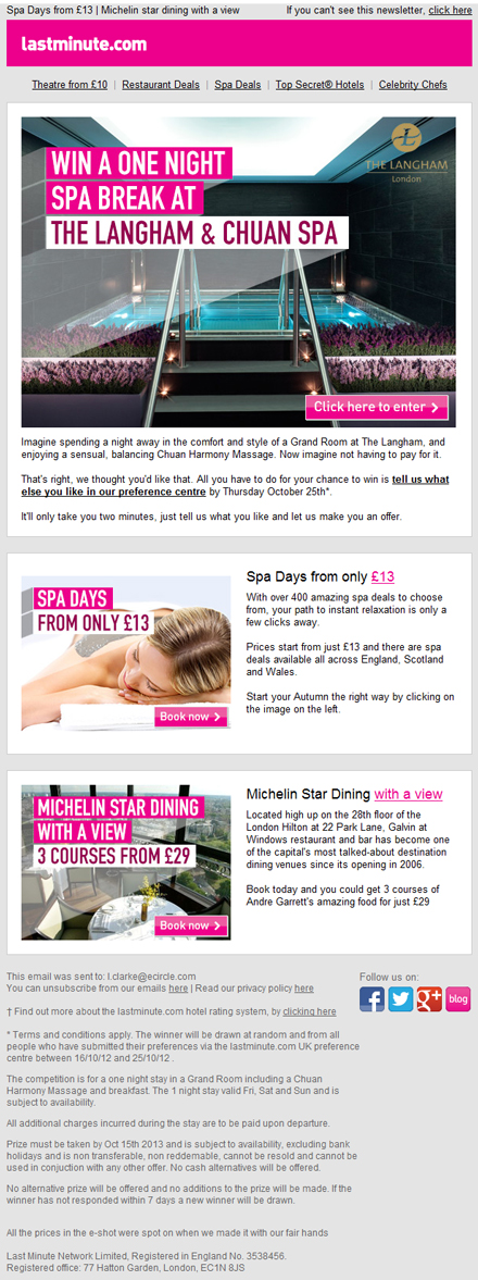
Clear, mobile-friendly design
There is a lot going for this email: its clean design and mobile-friendly layout mean that it is accessible across all devices. Here are some of my favourite features:
- A smart pre-header means the key message is shown after the subject in many scenarios, including the iPhone
- Simple navigation bar in web text, does not distract from the email, and the bold pink block and logo makes the email instantly recognisable
- Attractive aspirational image, with typography set in the style of the brand's iconic colours
- Buttons and text links are both in the visuals and copy
- One column grid and bigger buttons make for an easy user experience when opened on a small screen
- Playful copy, written in a tone that explains to the user how easy and quickly it is to update their settings (Lastminute.com could have added an extra line stating the benefits of updating your preferences but let’s not be picky)
- No tricks missed with secondary and tertiary offers, that complement the ‘indulgent’ key offer
- Social links are included, but are uncluttered and bold to make for an ‘easy tap’ on touch screens
Seamless customer journey to preference form
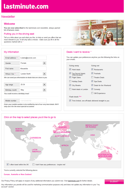
From a strong email to a stronger preference page, they haven’t lied: it really does take all of two minutes to fill out. The two column grid makes the process seem easy. A pre-populated form and easy to tick boxes help to halve the time. The clickable map to highlight places the user would like to go is a nice visual way of collecting information. It shows Lastminute.com’s global scale with its ‘round the world’ discounts.
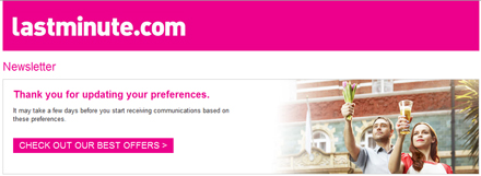
Friendly thank you page with good use of call to action
The ‘Thank you’ page has been thoughtfully designed, and not left until last. It’s branded with a friendly message setting user expectations (‘it may take a few days to update your preferences’) and a clear call to action driving traffic back to the site. I also like the use of image, with a couple holding up a champagne glass, subconsciously saying to the user ‘thank you’ or ‘well done’.
Most of all, I’d like to praise the very ‘mobile’ user journey. Like I said, the email is multi-device friendly and links to a responsive landing page; when opened on a smaller screen the form fits into a one-column grid and the map is replaced by easy to tap buttons. Clever.
Overall, Lastminute.com has done a great job. Let’s just hope the brand has a plan in place to use my data wisely. (I’m still hoping to win the spa break… even if it is staying in a 5* hotel in London at least it will be free!)
Lexi Clarke, Creative Consultant, eCircle



Please login to comment.
Comments