7 tips to optimise your landing page for mobile
24 Jul 2012
Imagine…
Imagine receiving a wonderfully crafted email on your mobile that has been designed and optimised for mobile. The call to action is well placed, the copy has been thoughtfully written and it achieves its objective – the subscribers are clicking through!
…Only to find a miserable, frustrating experience on the landing page, so they quickly go elsewhere, unsatisfied and with a sour taste in their mouth.
Unfortunately, not many of us have to imagine this scenario as I would expect it has happened to all of us – probably more times than we care to remember.
And it’s only going to get more commonplace as Litmus.com has just revealed that more subscribers are reading emails on mobiles than on desktops.
So – you’ve done the hard part – selling them on opening up the email and checking out what’s on offer and clicking – be sure to keep the momentum and don’t lose them here by having a less than pleasant and/or usable mobile experience. Econsultancy’s recent Email Marketing Census report found that almost 40% of companies describe their strategy for optimising email marketing for mobile as “non-existent”…. a very scary thought considering Litmus’ recent findings.
Dispelling some assumptions and myths
Success in email marketing is all about the email
The conversion more often than not, does not happen in the email. That’s right – an email is the vehicle (similar to PPC, QR codes, SMS, banner ads etc) that drives the traffic to the landing page – and this is where the conversion (purchase, register, request more information etc) happens. So, optimising your email is only part of the solution – which is why paying attention to the landing page is critical to the conversion. Email marketing is not just about the email – it’s about the entire journey the subscriber takes – including before and after the email.
You need a full mobile version of your website before you optimise your emails
Many brands I speak with are putting off optimising their email and landing pages until they have a mobile version of their website live. As admirable as this is, it isn’t necessary – basically, it’s better to start getting the experience right for your reader sooner or later – certainly before your competitor does.
You have to showcase all your products on your landing page
You don’t have to sell them everything AND the kitchen sink on the landing page – in fact this is strongly advised against. Keep the landing page focused to as few objectives as possible.
So, keeping in mind that your aim is to make it easy by removing all barriers to conversion, here are your 7 tips …ready?
1. Optimise the entire subscriber journey for mobile devices.
2. Be brief – this applies to the email as well as the landing pages.
3. Be single minded – try to restrict the landing page tasks to a single task if possible.
4. No distractions – don’t offer them to download this, or buy that or have a lot of other ads that will potentially divert their attention away from achieving the landing page’s objective.
5. Have an obvious and fat finger-friendly call to action placed above the fold. Remember to remove all barriers to conversion and make it as simple for them to achieve their (and your) objective.
6. Don’t make them guess. Be clear about what action they are to take. Give hints as to what you want them to do in the copy, the call to action within the email and the headings/subheadings – be the director of their journey.
7. Use Responsive Design using @mediaqueries…it isn’t as difficult as most people think.
A quick example using Secret Escapes
Single column email (below) from Secret Escapes persuades us to click through to find out more about the hotel.
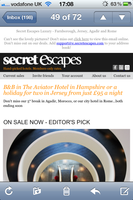
Upon clicking through we’re taken to a mobile optimised page (below) that is using Responsive Design (@MediaQueries) to determine which device we’re using – this particular version has been optimised for the iPhone.
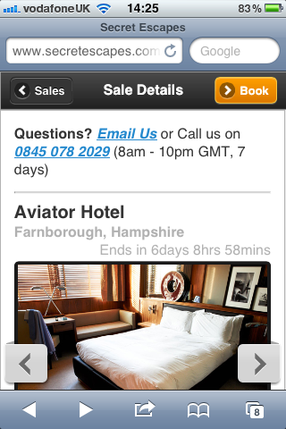
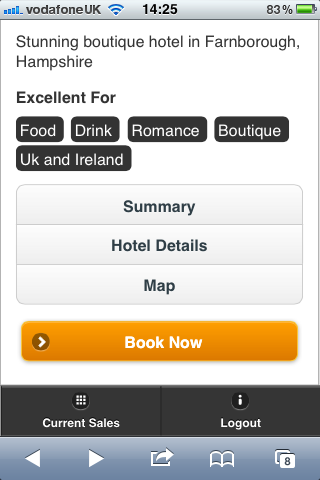
The call to action (Book) is clear, obvious and above the fold (i.e. in the first screen) as well as below the fold (see below image). Additionally (on the iPhone), by tapping a chevron, we’re able to see more images while still remaining on the first screen.
If we then scroll beyond the first screen of the landing page we see some other menu items (summary/hotel details/map) which expand and contract when they’re clicked.
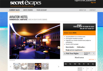
Below - the Desktop version of the landing page.
Kath Pay, co-founder, Plan to Engage
@KathPay
You can find more articles like this from the Email Marketing Council via 



Please login to comment.
Comments