Fresh Perspectives on D&AD Pencil Awards
21 May 2015
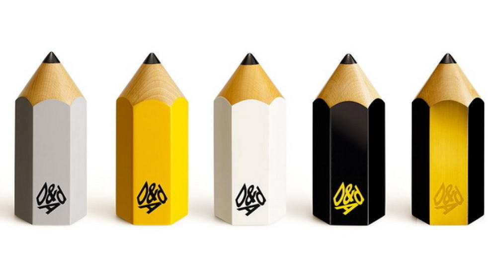
With the big Pencil winners announced tonight at the D&AD Awards Ceremony 2015, how did the picks from members of the DMA’s Rising Stars’ Fresh Perspectives Hub fare?
Their mission was to visit the D&AD Awards judging exhibition and pick three pieces of work that impressed the most, with relevance to innovation or creativity that applies to, or could be applied to, ‘brand experience’. Then share 50 words on what the work was and why it will win a Pencil.
Will the judges agree with the selections? Do you? What was your 'best in show'? We'd love to know.
Bonnie Stuart’s selection is:
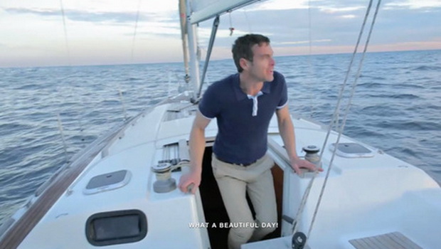
Guy Cotten’s ‘A Trip Out To Sea’
This was arguably one of the most visceral examples of brand activation I saw at D&AD. ‘A Trip Out To Sea’ is an interactive short film that plays out almost like a game (though a terrifying one), where the user’s role is essentially to stop a man drowning by fervently scrolling – an action that is represented by paddling in the film and one that is physically strenuous for the viewer. It's a simple ad and one in which the viewer is a genuine participant, so much so that without the viewer, the game doesn't work. Not only does this actively engage the consumer, it gamifies something serious – a trend very much alive at the moment – and really gets people talking. Viewers want to share the experience. It also opens up a commentary on the (very real) graphics and UX. It's a conversation starter. What is essentially a drowning simulator is an extremely effective way of bringing to life the dangers of drowning and thus the importance of life jackets.
[There's a really great picture to go here which you will be able to click on and see the video saved here: https://www.youtube.com/watch?v=0Uu_N1c7E2M ]
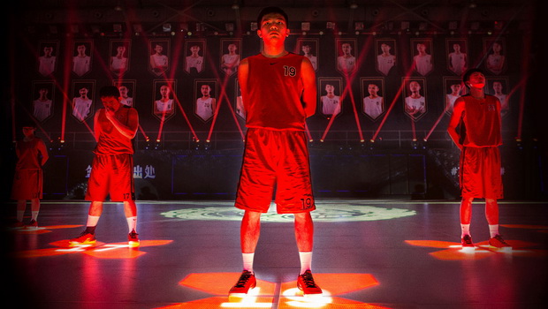
Nike RISE ‘House of Mamba’
Another brilliant example of brand activation was Nike’s LED motion-tracking basketball court. As one of the most physical applications of brand creativity, this was a clear winner when it came to brand innovation for activation. Nike employ a clever use of technology with the potential to innovate sport itself. Very forward thinking and it also clearly feeds back into the brand - Nike - who have a genuine commitment to bettering sport.
[There's a stunning image to go here, which will let you click and play the video saved here: https://www.youtube.com/watch?v=u2YhDQtncK8 ]
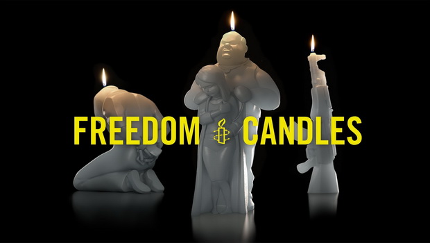
Amnesty International Freedom Candles
Not so obviously brand activation but incredible nonetheless was Amnesty International’s candles; candles which, once melted, revealed a figure of freedom being released from oppression (represented by the wax figure and outer layer itself). Though not done on a grand scale, the physicality of the process as well as what they represented made this a stand out entry.
[This image will be worth waiting for. It links to the video saved in this location: https://www.youtube.com/watch?v=s2w8KSdAOc0 ]
Rachel Lamb's choices are:
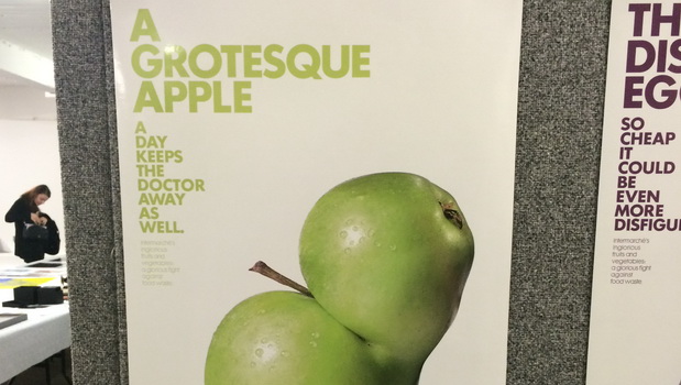
Inglorious fruits & vegetables
I loved this campaign both for the lovely clean photography and design as well as the very significant message about food waste. It is a subject that many of us are aware of and we are constantly told about the food that is being wasted but it is not something that I feel many of us consider. We are conscious of the fact that a large proportion of food wastage is down to supermarkets rejecting produce based on how it looks but many of us conveniently forget that we contribute to this every time we are doing our food shop by selecting the nicest looking fruits and vegetables from the shelves. For me the success of this campaign is that it uses humour to convey the important message to us that even if it looks a little different it will still taste just the same or provide the same sustenance we require. I found this campaign immediately striking from across the room and fell a little bit in love with these ugly fruits and vegetables in the same way that we Brits love to root for the underdogs. I think it will get a yellow pencil.
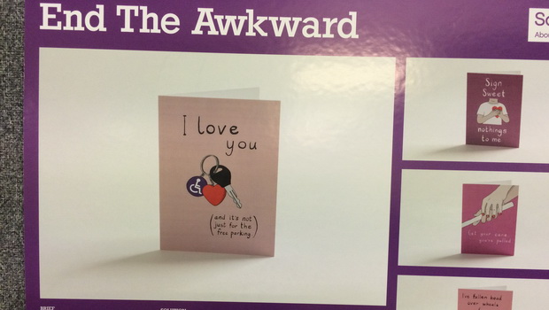
End the awkward
I really enjoyed this campaign as I felt it was brave and succeeded in its aim. The idea was to reduce the awkwardness that surrounds disability and seems to stem from the fact that we don't talk about these things. By highlighting the disabilities in a joke, without obviously making them the butt of the joke, it is showing everyone that these are okay topics to discuss. We suffer from an almost paralysing sense of political correctness in the country with people scared to say anything for fear of causing offense and yet by bringing these topics out into the open and discussing them we understand that we are all the same really and that everyone enjoys a joke. I felt this campaign was slightly let down by the quality of the design and presentation and could have been a little stronger if a bit more care had gone into these elements. I think it will get a nomination.
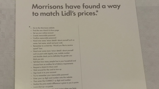
Lidl - Morrisons price match
I absolutely loved this campaign, I saw it online before the show and was very pleased to see that it featured at the show. I think it was a fabulously clever piece of writing which took a simple strong idea and executed it exceptionally. The design has not been overworked it is beautifully simple and clear and easy to understand. It uses a cheeky sense of humour to point out the ridiculously overcomplicated methods many supermarkets employ to try and lower prices and shows that really they just can't compete. I feel that even as a non-Lidl shopper, the cleverness and wit of this campaign could persuade me to give it a try. I think it will get a yellow pencil.


Please login to comment.
Comments