Creative effectiveness in door drop - examples from 2019
18 May 2019
Written by Peter Whittall, National Sales Account Exectutive of Direct Letterbox Marketing and member of the Door Drop Hub and Print Council.

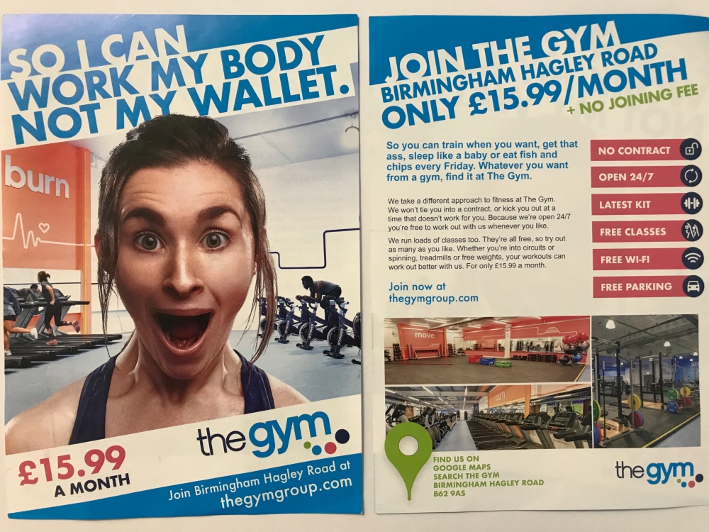
Photoshopped or just a jaw-dropping offer?
I returned home to be greeted by this colourful door drop from the Gym Group. I instantly questioned the woman's jaw-dropping expression to the point where I thought it had been photoshopped. The well-presented headline, "so I can work my body, not my wallet" stands out really well, using the alternate backgrounds to give a great colour contrasting headline.
The Gym Group logo is made up of four different pantone colours which are all used throughout the leaflet. Only using those four colours, is a great design technique for an eye-catching and vibrant leaflet. The price is clearly stated on the leaflet, giving the potential consumer an indication of the price, with no hidden extra costs or contract.
It's somewhat difficult to get a giggle from a marketing message, especially one from the medium of door drops. But the Gym Group give a relaxed, yet comical statement about using their gyms.
Overall, the leaflet has great balance of imagery, narrative, headlines to warrant engagement and a call to action. The door drop itself was targeted to a proximity to the gym, which was repeated a number of times to earn recognition for the brand and got a great response for new member sign ups.
Please login to comment.
Comments