Are high open rates holding you back?
09 May 2013
Our findings last month on the Obama campaign caused a lot of debate but the bare facts of our analysis still stand – had Obama’s team optimized for improved open rates, their send volumes would have dropped and their all-important donations would have followed.
Open rates remain a widely used and hugely misleading measure of performance and engagement in the email industry. At best they give you an idea of a campaign’s performance in isolation but at worst they lead email marketers to focus on optimizing the wrong strategies for their email program.
Here we discuss how to identify if maximizing open rates is holding you back and how to go about identifying the strategies that will have the biggest impact on your results.
The open rate paradox
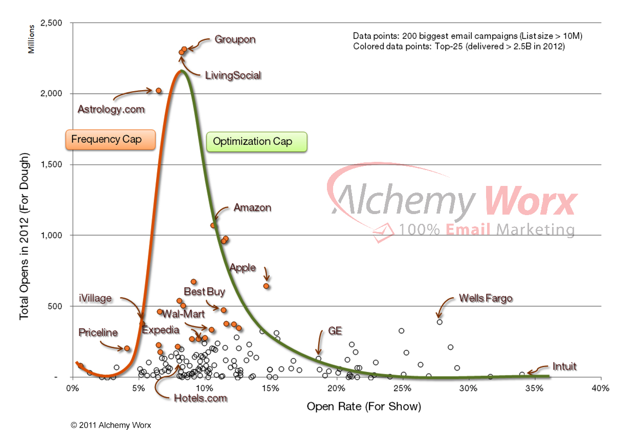
Using EDS Analyst we examined the relationship between open rates and total unique opens for the top 200 email senders by list size in the US for 2012.
We were confident that, like the Obama campaign, there would be an inverse relationship between rates and totals – so as rates increase, totals decrease and vice versa. We call this the open rate paradox or to paraphrase a popular sports trusim: rates are for show, totals are for dough.
Each dot on the graph below represents a single sender and we picked out some well-known brands as reference points.

Sure enough, the graph shows that for most large senders, there is an inverse relationship between open rates and the total number of opens – the higher the open rate, the lower the number of total opens. Rates are for show.
It’s also no coincidence that nearly all of the brands with the biggest lists (orange dots) also have highest number of total opens because they are sending more opportunities to open.
Although opens don’t directly correlate to revenue, even the most avid fans of open rate maximization would agree that the more people that actually open your emails, the more engaged your database and the more revenue or conversions you are likely to generate. Totals are for dough.
Keep it simple – focus on just three strategies
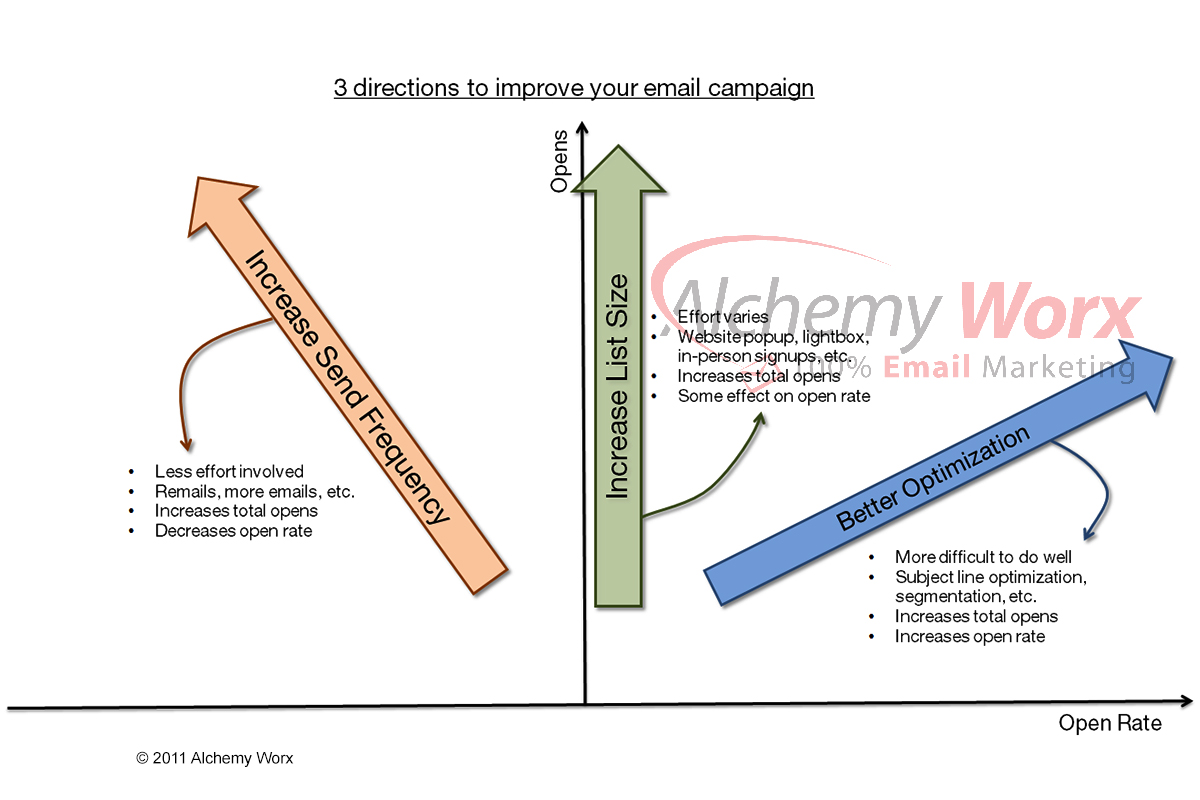
If your goal is only to improve open rates, then your strategy is simple: halve your list by suppressing your less active subscribers and watch those rates soar… and those total opens plummet! But if your goal is to increase total opens, then the bell curve in the graph above helps define three clear strategies:
- List size:
Has the biggest impact on totals and can be improved independently of the other two. - Increase send volume:
Significantly increases total opens for relatively little effort (low effort to gain ratio). - Optimize for rates
Increases total opens but requires the biggest effort (high effort to gain ratio).
Most brands are clustered towards the lower middle of the curve because it’s the easy place to be. By and large, they all put a similar amount of effort into their program and use the same undefined strategies.
The outliers, however, go above and beyond in one of three ways – those to the right have very high open rates, those to the left have high send volumes and those at the top are combining high send frequency with very big lists to produce massive send volumes.
In effect, this is the three different strategies implemented to their extremes.

Of course, there are limits to the effectiveness of each strategy and these are defined in the graph above by the orange line to the left (frequency cap) and green line to the right (optimization cap).
These boundaries exist because for any given list size there is point at which diminishing returns kick in for both frequency and open rate. And, as the big empty space to the right of the green optimization cap shows, it’s very hard to send a large volume of email while still achieving a high open rate.
So the basis of a successful email program is to continually grow your list while finding a balance between increasing send volume and maximizing open rates with better offers, targeting, subject lines, etc.
And you find that balance by ignoring your open rates…
Define your strategy by ignoring open rates
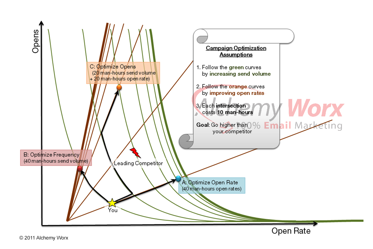
To illustrate the effect these strategies have on an email program, we have created a simple optimization chart, below. The green curves represent the impact of send volume on total opens and the brown lines represent the impact of open rate on total opens.
Each intersection represents a hypothetical 10-hour unit of resource, as a means of comparing the effort required to implement each strategy. As you get closer to each cap, the effort required to improve your totals with your chosen strategy increases exponentially.
 Imagine your brand is the star in the middle of the curve and you want to take on your leading competitor, the lightning bolt.
If you use open rates to define your strategy, then you focus your resource on maximizing those, route A. Your open rate may now be much better than your competitor’s but they are out-mailing you, so they are still creating twice as many opportunities to buy or convert.
If you choose to increase your send volume, ‘route B’, then your open rate drops but your total opens more than double. However, as you approach the frequency cap, the impact of your strategy diminishes and you still trail your competitor.
If you use totals to define your strategy, then you take ‘route C’, which balances resource between increasing send volume and maximizing open rates. Your open rate drops but you are finally creating more opportunities to buy than your competitor.
Smart email marketing is not just a case of increasing send volume indiscriminately or of only focusing on ever tighter targeting. There is a balance that exists for each brand, you just have to find your own sweet spot.
Total opens the key to optimizing your program?
In this instance, we have highlighted the open rate paradox using total opens because that was the data available. However, we’re confident you will find the same inverse relationship in your own campaigns with total clicks and, more importantly, revenue. And in the end that’s the only metric that matters!


