2012 Gold Best design or art direction | DMA

Filter By

Show All
X

Connect to

X

2012 Gold Best design or art direction

T-555e04dbe337c-best-design-or-art-direction-gold_555e04dbe315a-4.jpg

Client Lürzer’s International Archive

How did the campaign make a difference? Wit, detailed design, great copy and a key insight into the product made advertising creatives take note of Lürzer’s Archive once more and subscribe. This idea provided €8,000 of additional subscriptions in less than a month.

What details of the strategy make this a winning entry? How do you win over the world's most cynical audience: advertising creatives? Not by email. Or direct mail. It ended up ignored. This campaign had to remind creatives that Lürzer's is a great product. In the end, a line buried in their website- ’The World's Most Stolen Magazine’ - was the key. People borrow or steal their colleagues’ copies all the time because it's such a great product! Armed with this insight, the work highlighted the fact that because of great content and creativity everyone wants to steal Lürzer's Archive, and gave an incentive for subscribing rather than pilfering. This had to be done in a visually arresting way that would make cynical creatives think "I want it!".

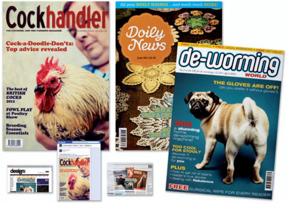
How did creativity bring the strategy to life? ‘Untouchable covers’ were anti-theft devices, fake magazine sleeves that, once wrapped around your copy of Lürzer's, would disguise it as a magazine so dull, controversial or unpleasant that no one would want to touch it, let alone steal it. Disguises included Bucket Collector, Spreadsheet Enthusiast, CockHandler, Doily News and, worst of all,Account Man Monthly. They had to look real, but wouldn't be doing their job if they didn't attract a second look. The balance was tough but was struck perfectly. The copy’s genuinely funny and little details like the spine and subheads reward repeat readings. The typography’s expertly crafted and the casting and photography are spot-on. This highlighted the world's most stolen magazine in a fun way that was also genuinely beautiful, by creating a desirable additional product to hide copies as a reward for subscription. This design gained international PR - even in competitor publications - that made the campaign punch well above its weight.

Results The covers were featured in major advertising publications worldwide, including Adage, Creativity Online, Creative Review, Design Week, Adweek, Campaign and hundreds of blogs. Most importantly, creatives loved the covers too. They talked, tweeted, shared and ultimately subscribed to get their hands on them. In just over a week the campaign had achieved 424 new subscriptions, up 500% on the previous period. That resulted in over €58,000-worth of new sales with ROI of nearly 10:1.

Team Justin Tindall - Executive Creative Director, Garry Munns - Creative Director, John Jessup - Creative Director, Ben Gough - Copywriter/Art Director, Lance Crozier - Head of Art, Fern Berresford - Photographer, Mark Denton - Art Director/Typographer/Designer, Kate Henderson - Designer, Alexandra Warner - Account Handler, Simon Gregory - Project Manager

Please login to comment.

Comments