What Makes Us Click?
05 Feb 2016
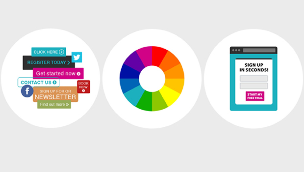
The Colour
Make sure you pick the right colour for your call to action. There’s no magic colour that converts better than others so pick one that contrasts and compliments, for example think orange on blue.
ORANGE: Encourages immediate action. Consider orange if you want people to sign up, buy or join right away. It’s also the colour most associated with cheap or inexpensive things.
RED: Increases energy and creates a sense of urgency. Try red if you’re running a sale, a limited time offer or selling tickets to an event that’s close to selling out.
YELLOW: Draws attention and creates low level anxiety. Yellow both promotes positive feelings and causes just enough anxiety to move people to action without stopping them in their tracks.
BLUE: Builds trust and security. It’s the most popular favourite colour in the world and is the choice for brands who want their customers to feel safe and secure.
GREEN: Promotes growth and relaxation. We all know green means go, which is pretty handy when it comes to CTAs. It’s also easiest for the eyes to process, so it’s often used to relax the mind.
85% of people say colour is the main reason they buy a product
Shapes & Sizes
Make sure you find the best shapes and sizes for your call to action. Rectangular buttons are by far the most popular, but don’t be afraid to test other shapes and sizes if they’ll fit your design,and A/B test.
ROUND: Round the corners of rectangular buttons. Our brains seek to avoid sharp or pointy corners.
BIG: Bigger is better. It should stand out, but not be so obnoxious that it hinders or overwhelms your design.
TAPPABLE: Make sure it’s large enough to be easily tappable on all devices.
CIRCULAR: Create and test out a circular button that looks like it’s begging to be pushed!
We recommend a button size of at least 44 x 44px
The Copy
USE ACTIVE VERBS: Try words like “Download,” “Get” and “Start”. Leading with an active verb will get people up and clicking.
BE SPECIFIC: “Download the guide” is better than “Click here”. Help your audience understand exactly what you want them to do and what will happen when they click.
KEEP IT SHORT: There’s not a lot of space, so don’t cram in a lot of words. It needs to be easily read and understood at a glance.
TRY USING 1ST PERSON: “Start my free trial” converts better than “Start your free trial”. This is an easy A/B test to try with your audience to see whether 1st or 2nd person works best.
CREATE URGENCY: Simply adding “Now” to your button can boost conversions. Make it clear with the copy that your offer won’t be around forever and watch click your rates soar!
One recent study found a 90% better conversion rate using 1st person
Please login to comment.
Comments