Series: Weaving a Better Web (Part 1 of 2)
07 Jul 2015

by James Nash
Director of Creative Technology, Wipro Digital
@C1rrus
When it comes to commissioning, designing or building websites, we’re often reactive to new trends instead of proactive. By itself, updating the technology we use to build websites won’t help us. We need to change perspective as well.
Once upon a time on the Web…
Not that long ago, it was assumed that most websites would be consumed via Internet Explorer, on a Windows PC, with a screen resolution of at least 1024 x 768 pixels. As a consequence, all manner of expectations and conventions arose. We knew how many pixels down "the fold” was and we put our critical content above it. It was “OK” to use proprietary Flash plug-ins and ActiveX controls. Restricting page items to rigid dimensions and positions was fine. Sure, there were other browsers and systems but nobody used them. We didn’t care.
Then those pesky smartphones arrived.
Suddenly, our customers wanted to engage with us on their phones. Unfortunately, our websites looked awful on those tiny screens, if they worked at all. The knee-jerk reaction was to produce mobile-only sites that co-existed with "desktop" sites.
Phew! Crisis averted.
But just when we thought we were safe, tablets arrived. Should we add yet another site optimized for tablets? Maybe we could just send tablet users to the mobile site? Or should they go to the desktop site? We gritted our teeth and muddled through.
Then, not long after, phone screens got bigger. Tablet screens got smaller. Phablets arrived. The boundaries blurred beyond recognition. Our neatly compartmentalized world collapsed. Where did phones end and tablets begin? What about retina screens? The ground beneath our feet was constantly shifting. We complained about fragmentation. Why did these devices have to be so diverse? Couldn't all phones just please stick to 320 x 480 pixels?

Photo © 2013 Luke Wroblewski. Some rights reserved.
We needed a more scalable solution. Fortunately, Responsive Web Design (RWD) and Adaptive Web Design (AWD) emerged to fill the void. Now we can build a single website that works on mobiles, tablets and PCs.
We are safe again - at least until the next big thing comes along.
But what if I told you the last few years could have been so much smoother.
What if I told you that whatever comes next, you and your website can be well prepared?
And what if I told you the way to achieve that has been staring us in the face since the inception of the World Wide Web?
Transcending the screen
One thing I’ve learned over the years is that, generally, programming languages, frameworks and software products are embedded with particular ways of thinking. Understand and embrace the original intent and philosophy behind a piece of tech, and you’ll get a lot more out of it than if you try to bend it into something it wasn't designed to do.
This is especially true for the Web. It was always meant to be a universal medium, a means of sharing information and utility with the whole world, regardless of how it would be accessed. Look closely, and you can see clues revealing this intent scattered throughout the technologies that underpin the Web: HTTP, URLs, HTML, CSS and JavaScript.
For the most part, none of these technologies assumes a screen-based or even a visual rendition of your content. Even CSS, which is used to lay pages out on a screen, allows you to specify how your page should sound when read aloud by devices or how your page should look when printed on paper. The technology is geared to work with an unpredictable multitude of devices, making no assumptions about the browser, device, or even the user. Pretty much the only thing you can convey definitively is the logical structure and meaning of your content. That’s the purpose of our old friend HTML. Everything else is a polite request.
CSS doesn't force a browser to layout a page in a particular way. It merely indicates a preferred representation of content and possibly, alternatives if your first choice cannot be achieved. JavaScript doesn't guarantee that your page will behave a particular way. It merely attempts the desired result, if the browser permits it.
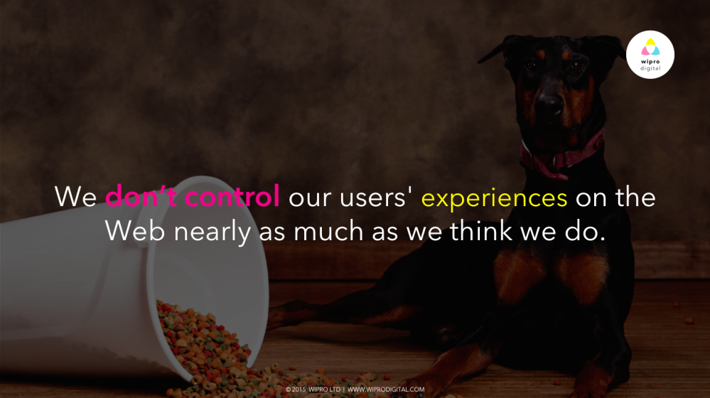
In other words: We don't control our users' experiences on the Web nearly as much as we think we do.
We never did.
Whatever control we thought we had was an illusion. Back when the world was dominated by one browser on one operating system on one type of device, we were lulled into a false sense of security. We began to believe that the Web was a relatively homogenous and stable environment within which we could design and build websites. It didn't take long before we forgot about the Web's bold original vision and equated web design with "1024x768 pixels on a desktop computer" design. As a result we developed all sorts of bad habits and warped expectations.
However, what we lack in control, we gain in flexibility. The Web gives us the building blocks to create experiences that adapt to the needs of our users on screens of any size and beyond!
Continue reading part 2 of "Weaving a Better Web".
Originally posted via Wipro Digital


1.png)

Please login to comment.
Comments